CSS Tutorial for Beginners
1. Introduction to CSS
CSS (Cascading Style Sheets) is used to style and layout web pages. It controls:
Colors, fonts, spacing
Positioning of elements
Responsive design (mobile-friendly layouts)
Basic Example
<!DOCTYPE html>
<html>
<head>
    <style>
        body {
            font-family: Arial, sans-serif;
            background-color: #f0f0f0;
        }
        h1 {
            color: blue;
            text-align: center;
        }
    </style>
</head>
<body>
    <h1>Hello CSS!</h1>
    <p>This is a styled paragraph.</p>
</body>
</html>
2. Ways to Add CSS
1. Inline CSS (Not Recommended)
<h1 style="color: red;">Inline Styled Heading</h1>
2. Internal CSS (Inside <style> Tag)
<head>
    <style>
        p {
            font-size: 16px;
            color: green;
        }
    </style>
</head>
3. External CSS (Best Practice)
<head>
    <link rel="stylesheet" href="styles.css">
</head>
styles.css:
body {
    margin: 0;
    padding: 0;
}
3. CSS Selectors
| Selector | Example | Description |
|---|---|---|
| Element | p { color: red; } | Selects all <p> tags |
| Class | .intro { font-weight: bold; } | Selects elements with class="intro" |
| ID | #header { background: black; } | Selects element with id="header" |
| Grouping | h1, h2, h3 { color: blue; } | Applies to multiple selectors |
| Descendant | div p { margin: 10px; } | Selects <p> inside <div> |
4. Common CSS Properties
Text & Font Styling
h1 {
    font-family: "Arial", sans-serif;
    font-size: 24px;
    font-weight: bold;
    color: #333333;
    text-align: center;
    text-decoration: underline;
}
Colors & Backgrounds
body {
    color: #000000;       /* Text color */
    background-color: #f5f5f5;
    background-image: url("bg.jpg");
    background-repeat: no-repeat;
}
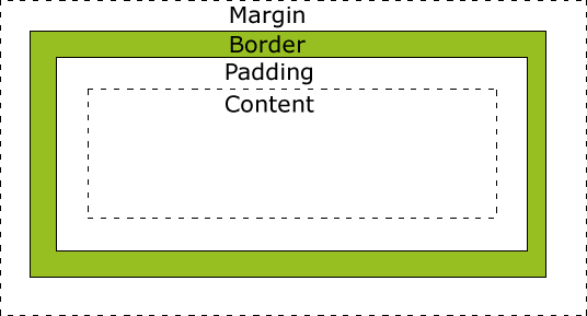
Box Model (Margin, Border, Padding)
.box {
    width: 200px;
    height: 100px;
    margin: 20px;       /* Space outside */
    padding: 15px;      /* Space inside */
    border: 2px solid black;
    border-radius: 10px; /* Rounded corners */
}
5. Layout & Positioning
Display Property
.block-element {
    display: block;     /* Takes full width (div, p, h1) */
}
.inline-element {
    display: inline;    /* Takes only needed width (span, a) */
}
.flex-container {
    display: flex;      /* Modern layout system */
}
Flexbox (1D Layout)
.container {
    display: flex;
    justify-content: center; /* Horizontal alignment */
    align-items: center;     /* Vertical alignment */
    gap: 10px;              /* Space between items */
}
Grid (2D Layout)
.grid-container {
    display: grid;
    grid-template-columns: 1fr 1fr 1fr; /* 3 equal columns */
    grid-gap: 20px;
}
Positioning
.relative-box {
    position: relative; /* Adjusts from normal position */
    top: 10px;
    left: 20px;
}
.absolute-box {
    position: absolute; /* Relative to nearest positioned parent */
    top: 0;
    right: 0;
}
.fixed-box {
    position: fixed;    /* Stays in viewport */
    bottom: 0;
    right: 0;
}
6. Responsive Design (Media Queries)
/* Default styles */
body {
    font-size: 16px;
}

/* Tablet (768px and up) */
@media (min-width: 768px) {
    body {
        font-size: 18px;
    }
}

/* Desktop (1024px and up) */
@media (min-width: 1024px) {
    body {
        font-size: 20px;
    }
}
7. CSS Transitions & Animations
Hover Effects
.button {
    background: blue;
    transition: background 0.3s ease;
}
.button:hover {
    background: darkblue;
}
Keyframe Animations
@keyframes slideIn {
    from { transform: translateX(-100%); }
    to { transform: translateX(0); }
}

.slide-box {
    animation: slideIn 1s ease-out;
}
8. CSS Best Practices
✅ Use External Stylesheets (Avoid inline CSS)
✅ Follow Naming Conventions (BEM, e.g., .card__title)
✅ Use Variables (Custom Properties)
:root {
    --primary-color: #3498db;
}
.button {
    background: var(--primary-color);
}
✅ Optimize for Performance (Minify CSS, use efficient selectors)
Comments
Post a Comment